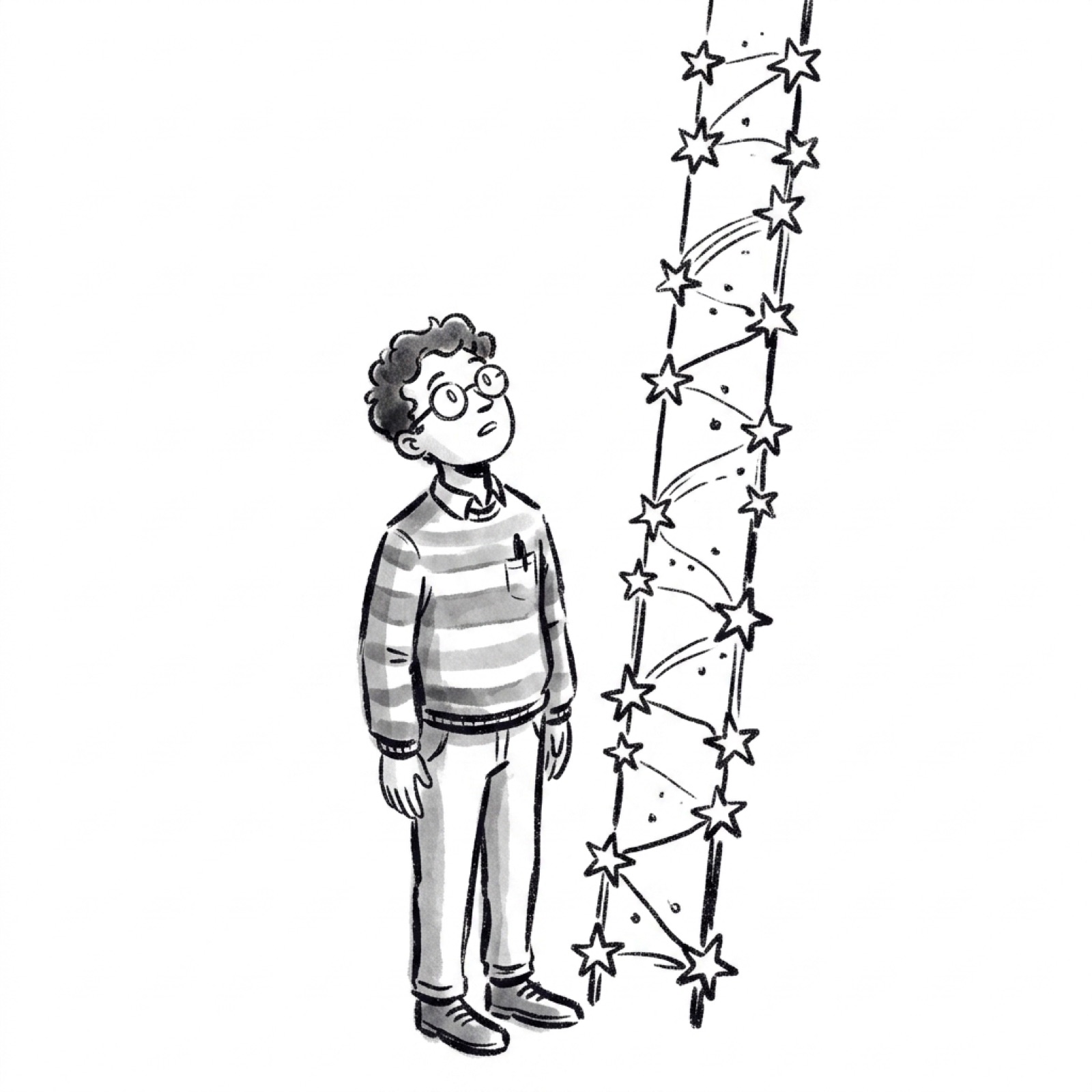
Most onboarding fails the same way. The team is proud of everything the product can do, so they show all of it at once. A feature tour, a checklist, three tooltips, and two modals stacked on top of each other.
The new user does not feel powerful. They feel lost.
That first session is where activation is won or lost. Confuse someone in the first five minutes and no amount of clever lifecycle email wins them back. So the instinct to "show them everything" is not generous. It is expensive.
There is a better model, and it comes from an unlikely place. Strategy games have spent decades teaching people genuinely complex systems without a single overwhelming screen. Their core trick has a name, and it maps almost perfectly onto product onboarding.
The oldest trick in strategy games
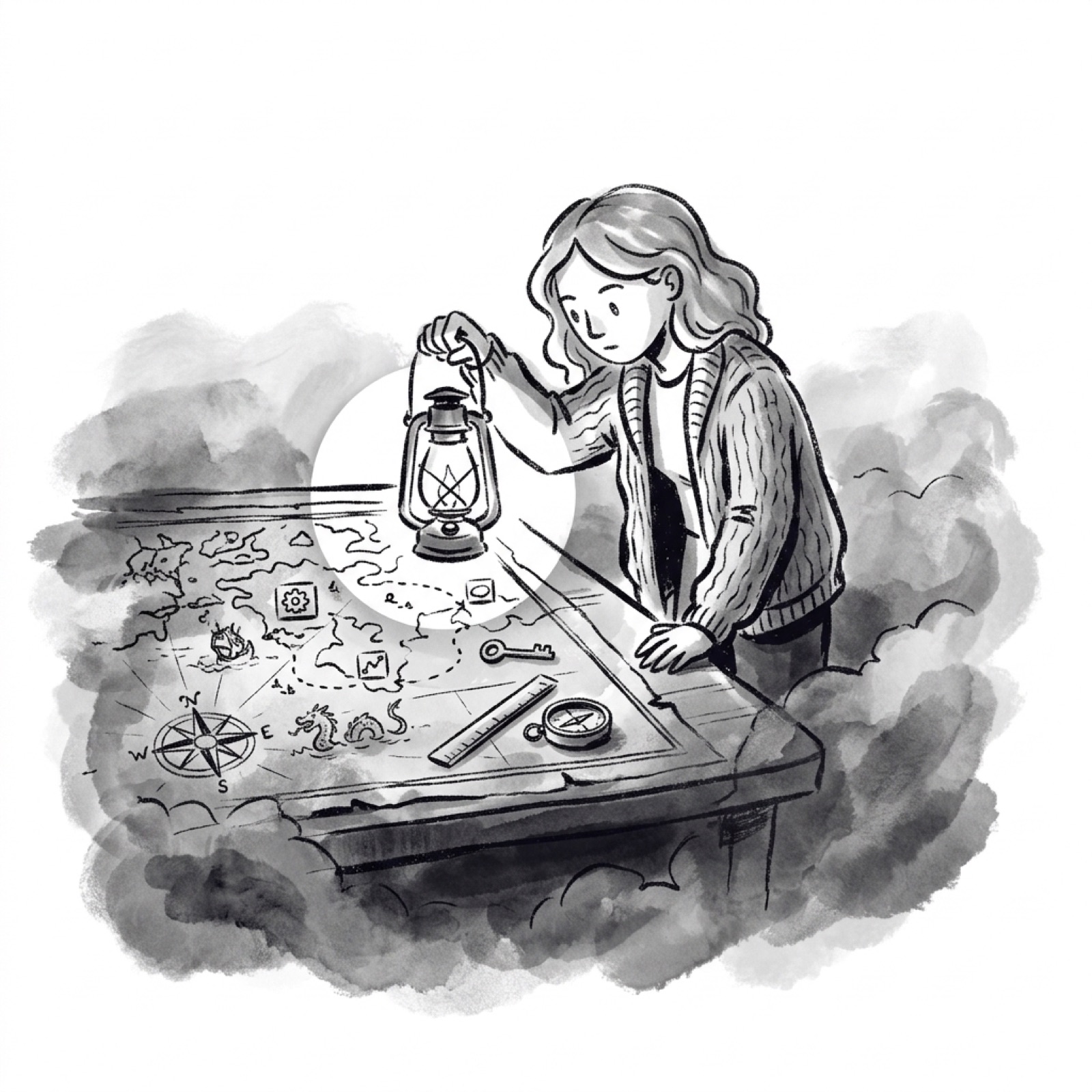
In a game like StarCraft, the map starts black. You see only a small circle around your own units. Move them, and the darkness peels back to reveal terrain, resources, and enemies. This is called fog of war.
The phrase is older than video games. It traces to the Prussian officer Carl von Clausewitz, who wrote in 1832 about the "fog" of uncertainty in battle. Game designers borrowed it. Early titles like Empire used the idea, Dune II brought it to real-time strategy in 1992, and StarCraft made it iconic.
Here is the part product teams miss. Fog of war is not only a limitation. It turns movement into discovery. Every step uncovers something new, so exploring the map becomes its own small reward.
Your product has a map too. It is every feature, setting, and workflow you have shipped. The real question is whether you hand a new user the entire atlas on day one, or let them uncover it as they advance.
Reveal, don't dump
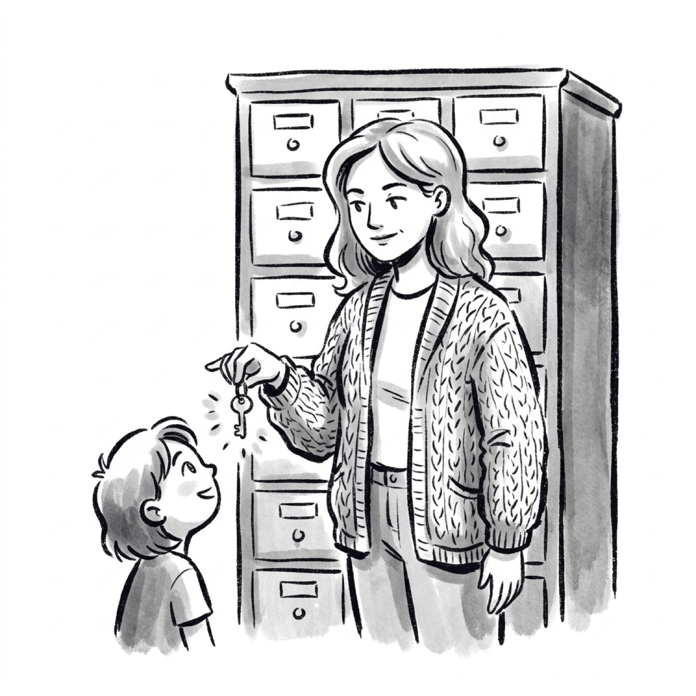
The interface version of fog of war already has a name. It is progressive disclosure, coined by usability expert Jakob Nielsen in 1995.
The rule is simple. Show only what the user needs for the task in front of them. Move advanced or rare options one step away, behind a click or a later stage.
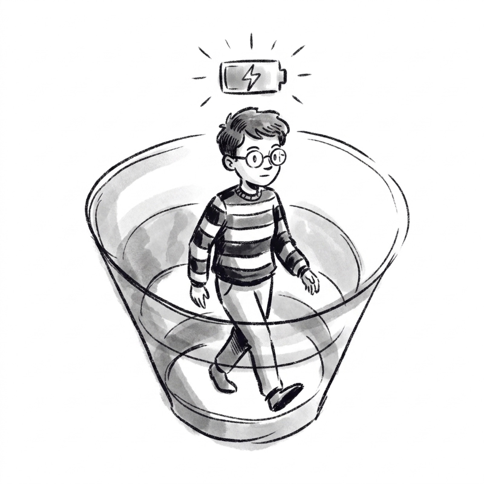
Why it works is about attention, not decoration. A first session has a tight budget of mental effort, and every visible button competes for that budget. Show fifty controls to someone who needs three, and you spend their attention on parsing the screen instead of getting a result.
You can see the pattern in tools you already use. A spreadsheet does not open with every function on screen. A design tool keeps its deep settings one panel away until you ask. The surface stays calm, and the power is still there when you reach for it.
For a product manager, this reframes a familiar fight. The instinct is to make every feature visible so it gets used. The evidence points the other way. A feature surfaced at the right moment gets more use than a feature that adds to a wall of noise on day one.
Show the handful of things that matter today. Let the rest arrive when they become relevant.
Decide what the first reveal should be
Progressive disclosure raises an obvious question. If you are going to keep most of the map dark, which part do you light up first?
The answer is the shortest path to a real outcome. Every product has a core action that delivers its first genuine win. The first message sent. The first file shared. The first lesson finished. Growth teams often call the moment that win lands the aha moment.
Design the opening so a new user reaches that action with as few detours as possible. Cut anything on the first screen that does not move them toward it.
The features you hide are not lost. They are waiting behind the first success, when the user finally has the context to understand what they are for.
Let people in before you ask
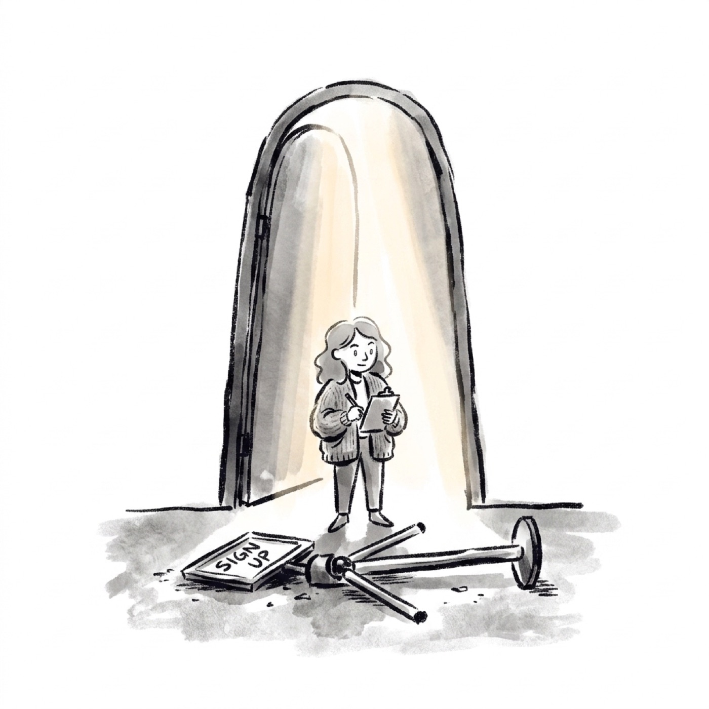
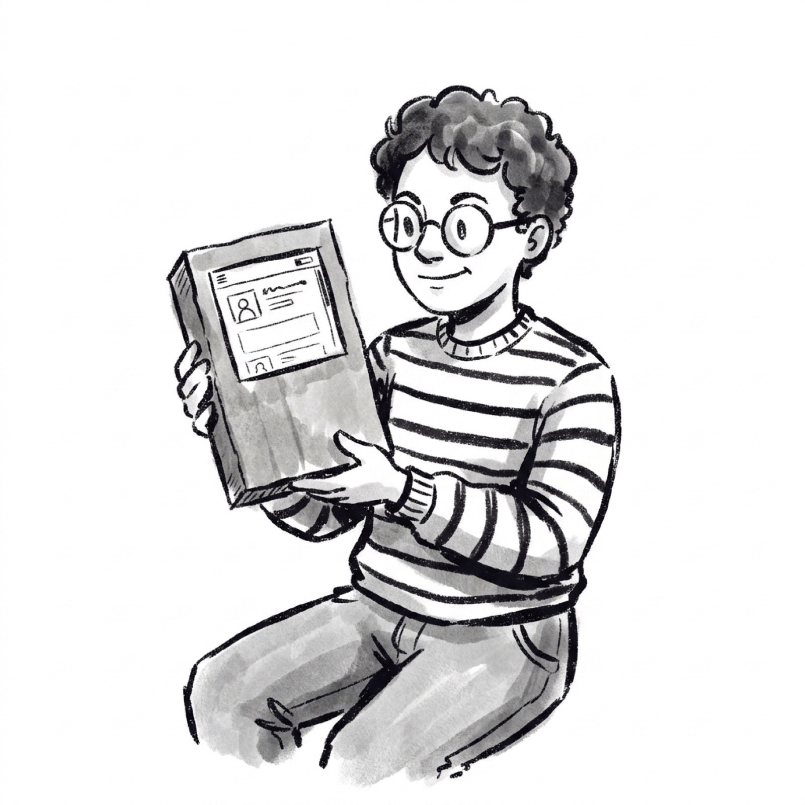
The most expensive thing you can do to a new user is ask for something before they feel any value. The classic offender is the signup wall on the very first screen.
Look at Duolingo, the language-learning app. It lets you finish an entire first lesson before it ever asks you to create an account. In their own A/B tests, delaying the signup beat asking for it upfront.
The reason is human. By the time the prompt appears, you have already felt the payoff. The account request now reads as a natural next step, not a toll gate in front of a product you have not tried.
Designers have a name for this too. Gradual engagement, a term popularized by Luke Wroblewski, means letting people interact and get value before you ask them to commit. Reveal the product first. Collect the commitment second.
Let people taste the product before you ask them to sign a contract with it.
Audit your own funnel for the reverse pattern. Anywhere you ask for an email, a permission, or a card before the user has felt a win, you are charging a toll before the ride. Every one of those gates is a place where curious people quietly leave.
The locked door that pulls people forward

Hiding the map is only half the job. The other half is making the next part visible enough to pull people toward it.
A feature you can see but have not unlocked yet creates a small itch. This is the goal-gradient effect. The closer a reward feels, the harder people push to reach it.
There is a clean study behind this. In 2006, researchers Joseph Nunes and Xavier Dreze ran a car wash loyalty program. One card needed eight stamps and started blank. Another needed ten stamps but arrived with two already filled in. Both required the same eight washes.
The result was not close. Over nine months, 19 percent of the blank eight-stamp cards were completed. The pre-stamped ten-stamp cards hit 34 percent. The mere illusion of progress nearly doubled follow-through. The authors named it the endowed progress effect.
Product teams already run on this. Duolingo reports that learners who reach a seven-day streak are 2.4 times more likely to keep going the next day. A streak is a visible, almost-reachable goal, and the fear of breaking it does the rest.
So do not just hide the next step. Show it locked, with a clear path to open it. A greyed-out feature with a real reason to unlock it pulls harder than a feature that simply is not there.
The catch: don't build a junk drawer
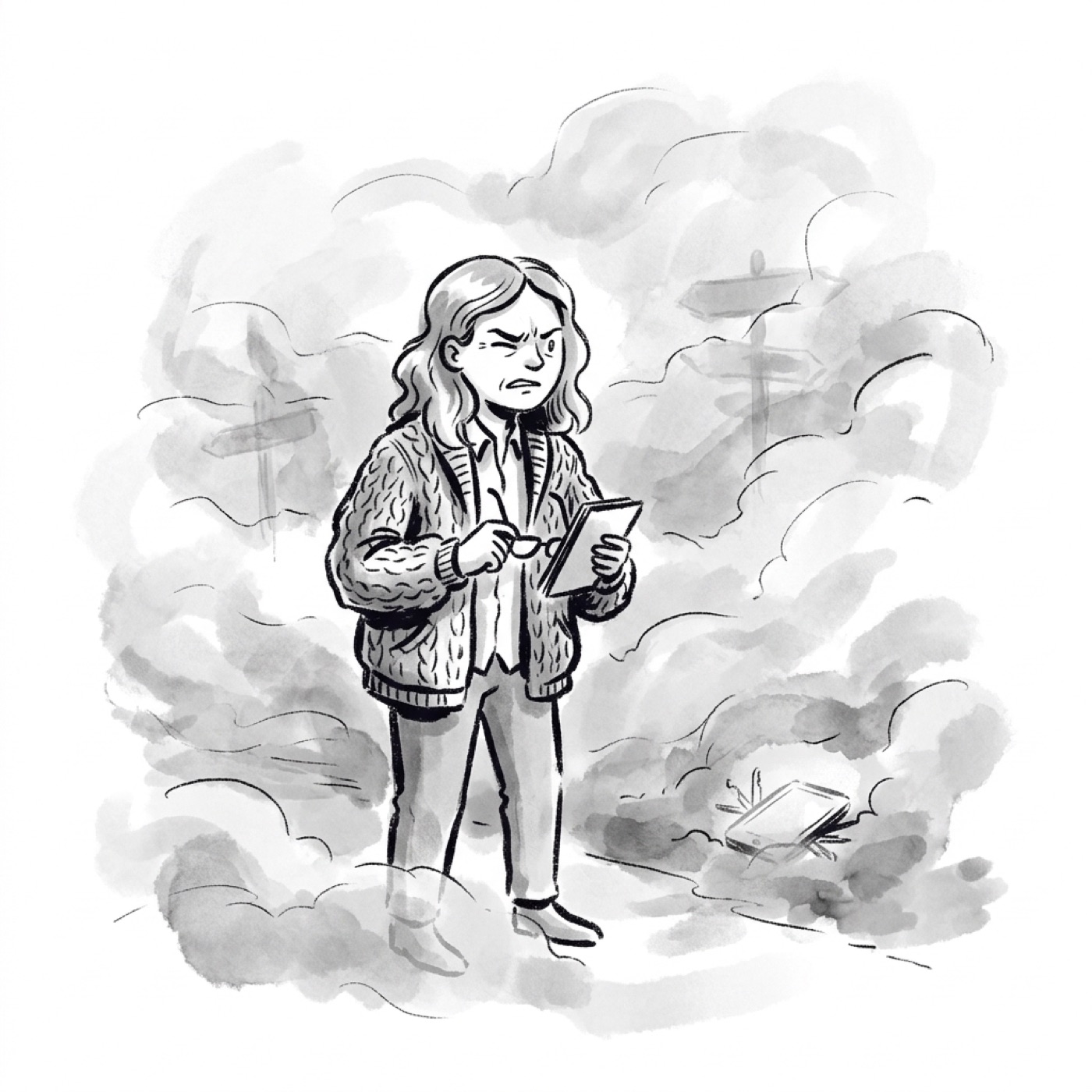
Here is where the metaphor bites back. Hide too much, and the fog stops helping. It just hides things.
The Nielsen Norman Group, a leading UX research firm, gives a blunt warning. Bury every feature behind an "advanced" label to dodge a design debate, and you build a junk drawer nobody trusts or ever reopens.
There is a measurement trap in here that product managers walk into constantly. You hide a feature, its usage stays low, and you conclude nobody wanted it. But low usage of a hidden feature has two possible causes. People did not want it, or people could not find it. In the dashboard, those two look exactly the same.
Hide the map on purpose. Then give every hidden feature a moment to resurface.
This is the discipline that separates progressive disclosure from quietly deleting your product. Every concealed feature needs a trigger, a specific moment in the flow that brings it back exactly when it becomes relevant. An empty state that offers the next tool. A prompt that appears the first time the user hits the wall it solves.
And you have to confirm real people actually hit that moment. Analytics alone will not tell you why usage is low, so watch a few real users try the task. A feature that no one rediscovers is, functionally, a feature you removed.
So pair every hidden thing with two commitments. A trigger that resurfaces it, and a test that proves people find it.
How to apply this to your product
You do not need a redesign to use any of this. Start with a single flow.
- Find the one feature you reveal too early. Spot the control that appears before a new user could possibly need it, and push it behind a moment of earned progress.
- Move your biggest ask later. If you gate signup, payment, or permissions before the first win, test delaying it until after the value lands.
- Add a visible locked step. Give users a greyed-out next milestone with a clear way to unlock it, so the goal-gradient works in your favor.
- Give every hidden feature a trigger. Write down the exact moment each concealed feature should resurface, then test that users reach it.
- Judge it by activation, not clicks. Measure whether more users reach their first real outcome, not whether raw feature usage went up.
The goal is never to hide power. It is to reveal power at the speed a new user can absorb.
Steal this for your next onboarding review
Fog of war works in games because uncovering the map is the fun. Your product can earn the same pull. Reveal features as people advance, ask for commitment only after they feel value, and keep the next step visible but locked.
This kind of thinking, connecting a game mechanic to an activation metric, is exactly what strong product interviews probe for. If you are sharpening those instincts, allthingspm.app lets you practice 4,000+ mock PM interviews, run interviews built from a real job description, and get your resume reviewed against a JD.
Hide the map on purpose. Then light the path one step at a time.
References
- Fog of war: origin and use in strategy games
- What is fog of war in gaming (glossary)
- Progressive Disclosure, Jakob Nielsen, Nielsen Norman Group
- Gradual engagement and the first screen, Appcues
- Duolingo lets users finish a lesson before signup, Appcues
- The endowed progress effect, Nunes and Dreze, Journal of Consumer Research 2006 (summary)
- How streaks keep Duolingo learners committed, Duolingo blog
- How Duolingo streaks drive daily retention (analysis)